ZAK AGENCY
AGENCY REBRAND
Three is the
magic number
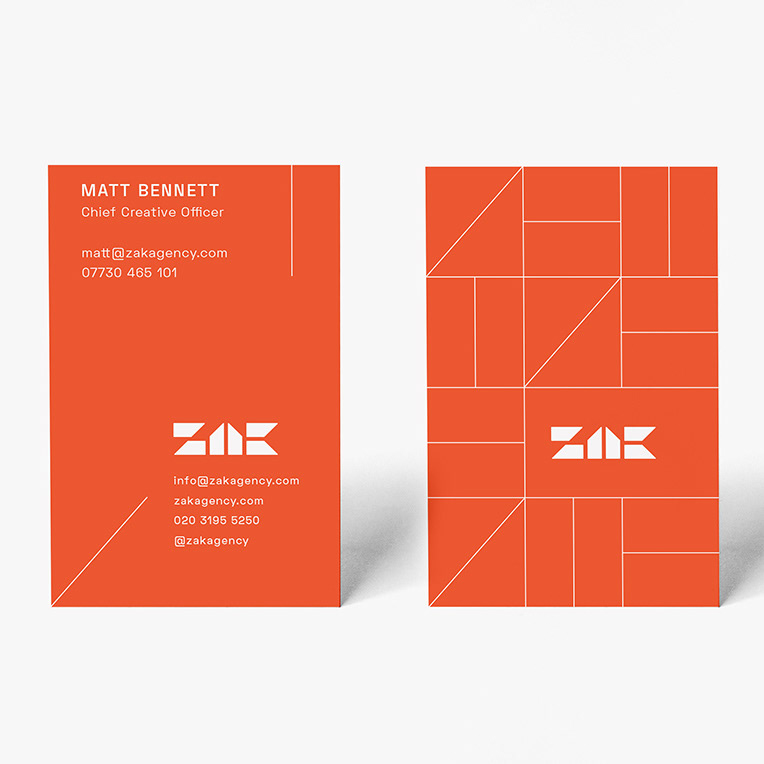
ZAK were after a rebrand. The brief was clear, the logo mark needs to be something unique and embody what ZAK is all about, so no generic san serif executions here! Add to that a design system that is simple, flexible and considered. As Head of Art at ZAK I knew the agency well and quickly saw that three is at the heart of the brand. The name has three letters, they have three brand pillars (brave, smart. spirited) and when pitching the natural number of routes presented is three.
I wanted to create an ownable custom typeface for the mark and after much experimentation landed on a single shape that when combined in different ways created the three letters. I then took the 3 different angles from each letter, diagonal, vertical and horizontal to create a background grid. Finally I explored further with the original shape to create a toolbox of icons with a strong relationship to the logo mark.
Concept and design
V
